The theme editor provides a point-and-click interface for system admins to define granular design and formatting settings for content.
Tip: Your theme dictates default format settings. You can change the appearance of report at any time by selecting different Styles or by editing formats in the various Formatting Panels.
Editor Layout
If you are an administrator, you can access the Theme Editor from the Design section of the Admin Console. On opening the page, you can see a table of themes. Select the theme you wish to edit or select Add or Import to open the following editor:
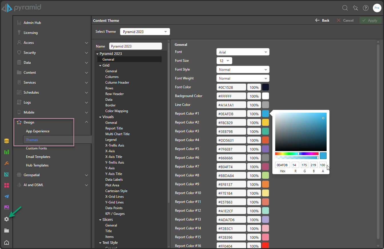
Theme Settings
The Settings are organized into a tree (orange highlight above), with each set grouped according to the item it affects. Theme settings include:
- General: Sets the standard font and color palette to be used throughout the theme.
- Grid: Sets the look and feel for grid visuals; determining the appearance of its columns, rows, and data cells.
- Visuals: Governs the look and feel for all other visuals (not grids), covering titles, axes, grid lines, legends, and range colors.
- Slicers: Sets the look and feel for slicers used in your reports. Defines the default colors, styles, title, and more.
- Panels: Governs the default appearance of panels, including their borders, when shown in presentations and publications.
- Text Style: Governs the look and feel for text elements in the app. Text elements are text boxes added in Present, Publish, and Illustrate.
- Insights: Sets the look and feel for the Smart Insights panel.
- Masters: Governs the main design ("masters") for Present dashboards and Publish report templates.
Style Inheritance
Selecting the Inherit checkbox for any setting (where available), applies the setting used by the parent. This makes it easier to create consistent styles that cascade through the style template from the top to the bottom. Inherited settings flow from the general element from each section and the general element from each section "cascades" through the theme.
Custom Fonts
Admins can import custom fonts into the platform, to be used in theme templates and for user to change the way text appears throughout the application.
General
|
Item |
Description |
|---|---|
|
Font |
Set the theme default font type. |
|
Font Size |
Set the default font size. |
|
Font Style |
Set the default font style. |
|
Font Weight |
Set the default font weight (bold, normal). |
|
Font Color |
Set the default font color. |
|
Background Color |
Set the default canvas color. |
|
Line Color |
Set the default line or stroke color. |
|
Report Color #X |
Set the default colors for data in the visuals, in the desired order. For example, in a bar chart, Report Color #1 will typically be the color that corresponds to the first bar, Report Color #2 the second bar, and so on. In a grid, Report Color #1 typically corresponds to the grid column headers, while Report Color #2 will serve as the default color for grid row headers. |
Grid
These settings either override the equivalent General settings for Grids or are settings that are specific to Grids only. Where applicable, you can select the inherit checkbox to apply the settings from the General tab.
|
Item |
Description |
|---|---|
|
General |
Sets the font type, size, style, weight, and color, as well as the canvas color. |
|
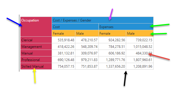
Columns |
Sets styling of the column layer in a matrix or tabular grid (green arrows below). The settings are font, font size, font style, font weight, font color, padding, and vertical padding. |
|
Column Header |
Sets styling of the column headers in a matrix grid (purple arrow below). The settings are font, font size, font style, font weight, font color, padding, and vertical padding. |
|
Rows |
Sets styling of the row layer in a matrix or tabular grid (yellow arrow below). The settings are font, font size, font style, font weight, font color, padding, and vertical padding. |
|
Row Header |
Sets styling of the row headers in a matrix grid (blue arrow below). The settings are font, font size, font style, font weight, font color, padding, and vertical padding. |
|
Data |
Sets styling for cells in a matrix grid (red arrow below). The settings are font, font size, font style, font weight, font color, padding, vertical padding, text alignment, and background color. |
|
Border |
Sets border styling for the Grid (black arrow below). The settings are width and color of the cell lines of the grid |
|
Color Mapping |
Sets the mechanism that automatically applies the general colors to the columns and rows of a matrix grid. With independent settings for the colors of a tabular grid. |
Visuals
These settings either override the equivalent General settings for Visuals or are settings that are specific to Visuals only. Where applicable, you can select the inherit checkbox to apply the settings from the General tab.
|
Item |
Description |
|---|---|
|
General |
Sets the font type, size, style, weight, color, and canvas color. There is also a Radius option, which controls the default radius size where rounded styles are applied. For more information, see below. |
|
Report Title |
Font preferences for the report title (black arrow below). |
|
Multi Chart Title |
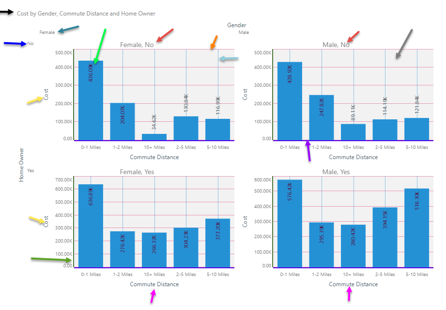
Font and alignment preferences for trellis chart titles (red arrows below). |
|
Legend |
Font, position, and line preferences for legends and legend titles. There is also a Radius option, which controls the default radius size where rounded styles are applied. For more information, see below. |
|
X-Trellis Axis |
Font preferences for the x-trellis axis in multi charts (teal arrow below). |
|
X-Axis |
Font and line preferences for the x-axis for a given chart (purple arrow below). |
|
X-Axis Title |
Font and line preferences for the x-axis title (fuchsia arrow below). |
|
Y-Trellis Axis |
Font preferences for the y-trellis axis in multi charts. (blue arrow below) |
|
Y-Axis |
Font and line preferences for the y-axis for a given chart (green arrow below) |
|
Y-Axis Title |
Font and line preferences for the y-axis title. (yellow arrow below) |
|
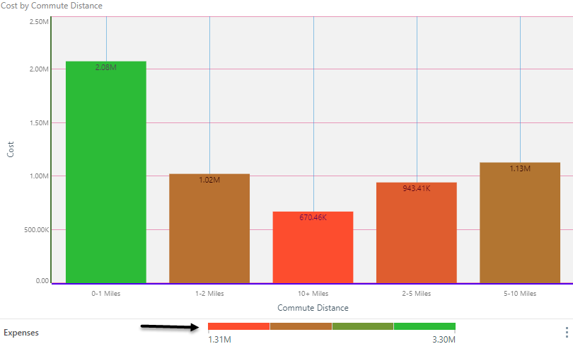
Data Labels |
Font and background preferences for data labels. (light green arrow below) |
|
Plot Area |
Set the background color for the plotting area, as well as the line width and color. (gray arrow below) |
|
Cartesian Style |
Set the opacity setting. (0= transparent, 1=opaque) |
|
X-Grid Lines |
Set the line color and width for x-axis grid lines (vertical) (orange arrow below) |
|
Y-Grid Lines |
Set the line color and width for y-axis grid lines (horizontal) (light blue arrow below) |
|
Data Points |
Set the default outline thickness for data points (for line, area, point, scatter and bubble) |
|
KPI/ Gauges |
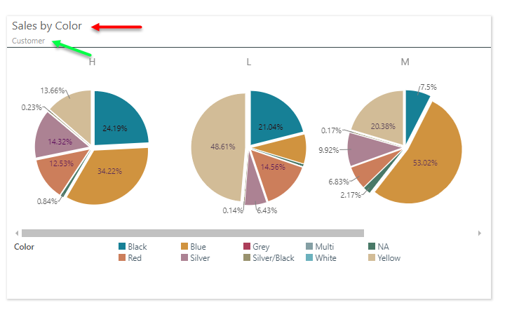
Sets the default color bands for conditional formatting, KPI's, gauges and continuous legends. Designers can set 4 sets of bands: 2,3,4 and 5 band color sets. The "target" and "Actual" colors are used for bullets Gauges. |
KPI/ gauge range colors can be seen below:
Slicers
|
Item |
Description |
|---|---|
|
General |
Set the default slicer style, and border color, opacity, and width (black arrow below). There is also a Radius option, which controls the default radius size where rounded styles are applied. For more information, see below. |
|
Title |
Set the default font preferences for slicer titles (red highlight below). |
|
Items |
Set the default font preferences for slicer elements (green arrows below). |
Panels
Governs the default appearance of panels when shown in presentations and publications.
|
Item |
Description |
|---|---|
|
General |
Set the default formatting values for any new panel added to your presentation or publication. These options relate to the panel as a whole.
Tip: For users building a presentation or publication, these defaults can be overridden from the Settings tab when viewing Panel Settings in the Formatting Panel. |
|
Header |
Set the default formatting for the fonts used for the panel title (blue arrow below). These options define the default appearance of the Title, including its font, font color, and size. |
|
Breadcrumbs |
Set the default formatting for the fonts used for the panel breadcrumbs (green arrow below). These options define the default appearance of the Subtitle, including its font, color, and size. |
Text Style
|
Item |
Description |
|---|---|
|
General |
Set the font type, size, style, weight, and color for the main text style. |
|
Heading 1 |
Font preferences for the main header style. |
|
Heading 2 |
Font preferences for the secondary header style. |
|
Heading 3 |
Font preferences for the tertiary header style. |
|
Heading 4 |
Font preferences for the last header style. |
Insights
Sets the default look and feel for the Smart Insights panel. The Smart Insights panel can be opened for presentations at runtime and when viewing discoveries, including in the Viewer.
|
Item |
Description |
|---|---|
|
Background Color |
Set the default canvas color for the Smart Insights panel. |
|
Section Header |
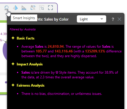
Set the font settings (color, weight, and so on) for the headers shown in the Smart Insights panel. In the following example, the headers are Basic Facts, Impact Analysis, and Fairness Analysis. |
|
Text |
Set the font settings for the basic text used for the insights in the Smart Insights panel. In the following example, the bullets describing the individual insights are affected by changes to these font settings. |
|
Highlight |
Set the font settings for the highlights that appear in the insights. In the following example, the values are highlighted. |
The following example shows the Smart Insights panel when opened from the Panel Tools at runtime. The theme was customized to change the colors of the background, section headers, text, and highlights:
Masters
Each theme can include full page designs for Present dashboards and Publish reports using master pages. Existing master pages can be attached to a given theme, which will then become the default master page design deployed when that theme is used.
- Click here for more information.
Radius Settings
The settings relating to Visuals (including Legends) and Slicers allow selection of a Radius setting (brown arrow below):
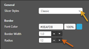
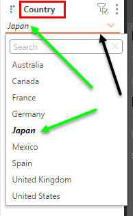
The Radius setting applies a curve to the corners of some items in your visual. Where the radius is 0, the items have sharp corners (right-angles). Increasing the radius adds a curve to the corners, making each tile into a rounded rectangle. The larger your Radius is, the more pronounced the curve is. The Radius setting is applicable to some Cartesian Charts, Segment Charts, Bullet Charts, Tree Maps, Sunburst Charts, Slicers (Classic style dropdown slicers and Buttons), and Legends. For example, where a theme specifies that Slicers use the Classic style (orange arrow above) and have a 12 point radius (brown arrow), any new dropdown slicer has the following default appearance:

The dropdown list itself is not contained by a square box, but has curved corners whose curves are set with reference to the Radius in the theme.